Wednesday, December 19, 2012

Final Floor Plans and Model

My floor plans have angular walls that reflect the angles of the triangular prisms. The angles were inspired the triangular site and the the park across the site.  I added some furniture to my library floor plans and made some changes. I added an egress to the auditorium and connected it to the buildings egress stairs, which can be seen on the lower right side of the ground floor plan.
Ground Floor Plan


1st Floor Plan


The Second Floor Plan has a two levels: the main floor and the cafe. There is a set of stairs leading down to the cafe and a ramp with glass walls that leads to the cafe as well. This can be seen in the 3D model I included below. 

2nd Floor Plan


 The Section shows the flow of space from floor to floor and the set of stairs leading to the cafe can be seen here. I used the concept of solid and void from my study models to arrange the Library Building and the Library Park.
Longitude Section


Here is the site plan for my model, facing true north


The South Perspective Elevation shows the Library Park, which mimics the buildings walls and creates a playful experience when you walk through.
 
South Perspective Elevation
The North Perspective Elevation is all glass and creates a view from the inside of the library looking outside. You can also see the movement and silhouettes from people as you approach the library. The main entrance to the library is located to the left side and features three glass doors.
North Perspective Elevation

 
East Perspective Elevation


West Perspective Elevation
 
Perspective1
 While building my 3D model on sketchup, I decided to incorporate balconies on the 1st and 2nd floor. This will allow people to enjoy the outside view from the west side of the building as well.
Perspective2
 

 The roof has glass on the north sides which allow indirect light to enter the library and illuminate the interior spaces. This was my initial goal for the library, to allow natural light to enter.
Birdseye View 


Site in Context

Wednesday, December 5, 2012

Floor Plans and Sections


For my library project, I decided to eliminate books and fully integrate the digital era and digital library concept. I'll have computers, touchscreen monitors, and a lot of outlets/ usb ports for people to connects their own laptops, ipads, or device. The library will also have a digital database where people can access digital books, articles, journals, videos, etc. Behind the library, there will be a digital sculpture park that will also mimic the lines and angles of the library. I'm still modifying the floor plans, but here an overview of what my concept is starting to look like.

The first floor has an info desk, staff room, periodicals with seating space, and a carrels with group study space (still undecided about this space). I decided to have an entrance to the library and a separate entrance to the auditorium, because it's located at the back of the library. It has a vestibule for easy access to and from the library without having to go all the way around to the main entrance.

First Floor Plan

The grand stairs in the center of the building take you to the second floor where you'll find yourself overlooking the main entrance. There's also a reading room and more workspace carrels. The auditorium is double height, but doesn't take up the entire two floors.
Second Floor Plan

The third floor has a computer room, lounge, and cafe. There are stairs going down to the cafe with a ramp for wheelchair accessibility.
Third Floor Plan


Here is a section diagram showing how the cafeteria works. The blue line is where the cafeteria would be located and there would be stairs and a ramp leading you down. I'm still working on this section.
Section Diagram


Section Sketch

I started working on sketchup to have a better vision of what my building would start to look like. This model is not done of course, but you do get an idea of what the spaces and elevation are going to look like.
SketchUp Model

SketchUp Model

Tuesday, November 20, 2012

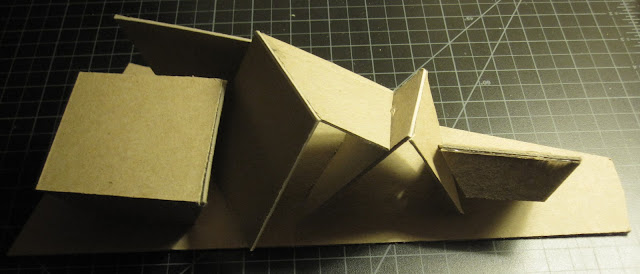
concept study model

From the model with the triangular paper clips, I came up with a concept model that transformed the 2D triangles into 3 dimensional spaces. I let the five main components of the library decide the five triangular spaces I used for my model.


My inspiration for designing my building project was Libeskind.

Monday, November 5, 2012

Collages and Models

For this assignment, I had to make 3 collages that showed my site impression of the Manhattan site, the word 'connection' and the program of my building type. For each collage, I created 3 models that represented the collage.


This collage shows my site impression of the Manhattan site when I went to visit it. The site was a triangular lot and so immediately I thought of triangles and different angles. The lot also had a solid building, followed by an empty and abandoned lot, followed by a solid building. I noticed the site had a neighborly side as well, which is why I have people in my collage.


 Models from Site Impression Collage

The left model represents the different angles the site had and the slope that it sat on. The next model shows all the triangular shapes of the site and near the site, as well as how they are or can be connected to each other. The right model shows the idea of solid and void or how I found the site to be semi abandoned. 


This collage represents the word 'connection.' I showed how tracks connect destinations together, as well as roads and bridges. I also thought of how a the links of a chain are connected and how the internet keeps the world and society connected.


Models from "Connection" Collage

The left model represents railroad tracks. This model is on the literal side, and so I'll be remaking  this model more abstract. The middle model represents the connection of roads, bridges, and chains all connected to each other. The right model represents the internet connection and how different people can be all connected at the same time.


This collage represents the program of my building. I'm doing a modern library that can relate to today's technology and how people are using libraries nowadays. I want to have books in my library program, because I believe that is what makes a library. Also I'll include more computer stations and workspace with outlets that allow people to plug in and use their laptops, tablets,phone or other electronics.

 
Models from "Building Program" Collage

The left model represents the unfolding of books and how it's rapidly transforming  digitally. The middle model represents the digital component of my library like computers and touch screen catalogs, etc. The right model, represents the theater component of my program, but I'm not satisfied with how this model turned out because it's very bland. I'll be remaking this model as well and will be updating this post with my new models.

Sunday, October 21, 2012

Furniture

I am using this excerpt from the library section in the 'Time Savers for Building Types' book. This will help me figure out what furniture dimensions I should use as well as how I can plan the space layout for the different programs I'll  be using in the library.


Wednesday, October 17, 2012

Site Analysis- Manhattan Site

For this semester's project, I will be working on the Manhattan Site. My team and I made a site analysis, which you can refer to at the link below:

Manhattan Site Analysis